
Product Design · Brand Design · UX Research
Overview
Axoft is a Dutch IT and telecom managed service provider based in Rotterdam. Under its "Axoft EASY" solutions, it handles cloud workplaces, cloud telephony, mobile device management, and security for business clients, on top of hardware, software, and managed services, so companies can hand off their IT and telecom stack instead of running it themselves.
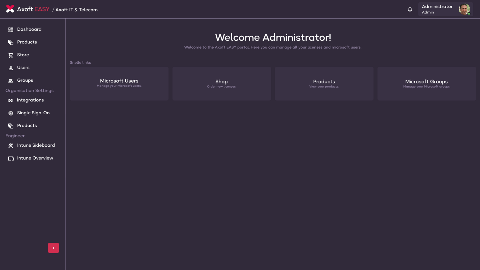
When I joined Axoft in 2025 as a UX Designer, the product now known as Charlz was in its earliest stages, just a portal called Axoft Easy that carried the same visual identity as the main Axoft website. Functionally, it offered IT license management and a store for ordering licenses. That was it.
But there was something else already there that mattered more than the feature set. The team genuinely believed this product could change how IT service providers and their clients worked together. The core idea was transparency, giving both sides of the relationship a shared view of what was happening with their IT, telecom, and security stack, in real time.
What the product needed was to grow into that vision. That meant building new features, but it also meant giving it a brand and design language it could actually grow with.
Charlz hasn't stopped evolving since. Almost nothing gets built in isolation. It's tested against real reactions from the clients using it day to day and the Axoft team on the MSP side, and adjusted from there.
Discovery
Rather than arriving with a direction, I started by running a visual DNA workshop with the team. The goal was to surface what Charlz should feel like to the people who were going to build it and use it every day, not just aesthetically but in terms of values and personality.
The workshop brought together different voices from across the team. Together we worked through what we wanted the brand to stand for, what it should feel like to interact with, and what visual language would carry that forward.
I wanted the design to be something we could all be proud of, and I believed that keeping the team's opinions at the centre of it would create more motivation to keep evolving and take ownership of the product.
Five keywords emerged clearly from the workshop.
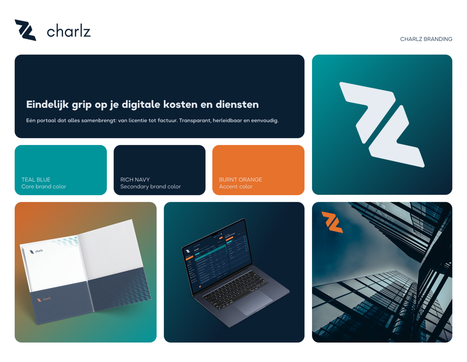
Alongside this, every team member independently gravitated toward blue and teal as the colour direction, a strong signal that aligned well with the values we'd articulated. Blue carries trust and reliability, and teal pushes it toward something fresher and more modern. Together they gave us a foundation we could build from.
Design
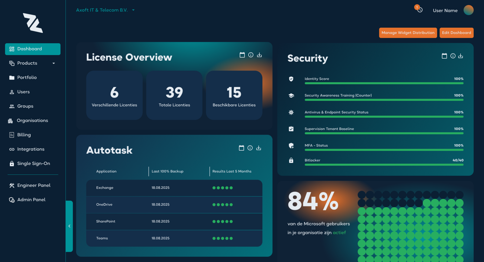
The first redesign kept the base structure of the portal intact but replaced everything about how it looked and felt. I worked from the workshop outputs directly. The colour palette moved to blue-teal, the visual language became cleaner and more restrained, and the overall tone shifted from "internal tool" to something that could stand on its own as a product brand. That wasn't just a cosmetic shift either. A cleaner visual language meant a clearer hierarchy on dense screens like license overviews and dashboards, where users needed to scan for what mattered rather than read everything.
Charlz became its own entity, separate from the Axoft visual identity. This mattered, not just for perception, but for how the team felt about the product. When something has its own name, its own colours, its own personality, people take ownership of it differently.
Before · Axoft Easy
After · Charlz
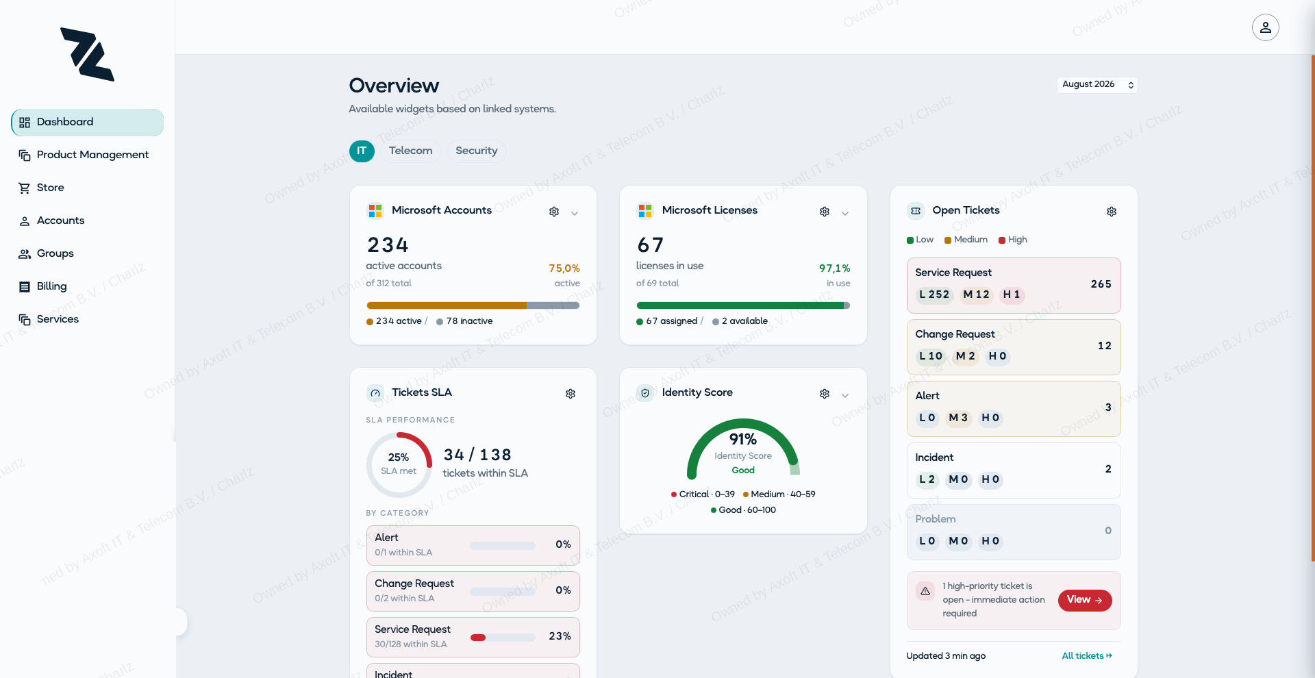
As the product matured and the team grew more confident in what Charlz was, we did a second, more substantial redesign. This one was driven less by brand and more by usability. The same ongoing feedback loop with MSPs and clients kept surfacing the same complaint, that the layout made people hunt for information instead of seeing it at a glance. So the dashboard and portal pages were rethought from the ground up, restructuring the information hierarchy so the most relevant status and alerts sit up front, with detail available but not competing for attention.
We also introduced light and dark mode, giving users control over how the interface presents itself across different environments and preferences.
It was around this point, about six months in, that I was promoted from UX Designer into a role combining both UX Designer and Product Owner. The shift came from how involved I'd already become in shaping what the product should become, not just how it should look, and it gave me a say in what we prioritise, not only how we design it.
Light mode
Dark mode
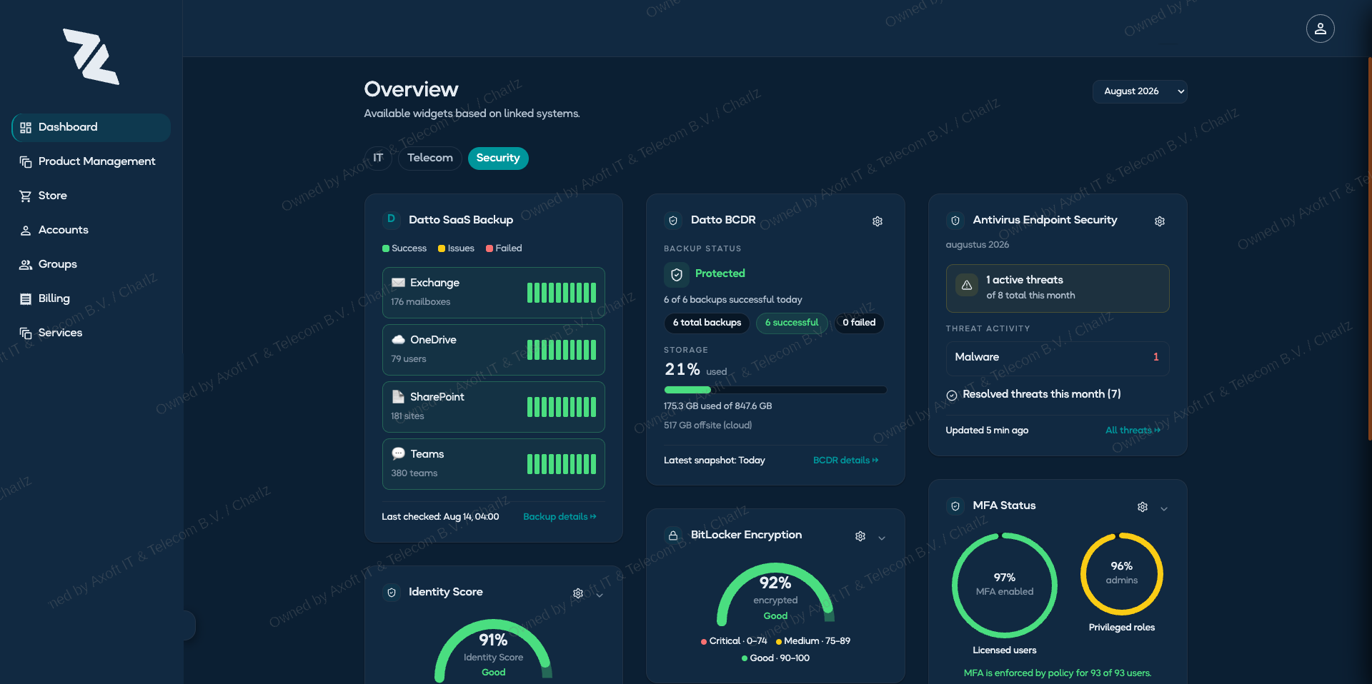
Product
One of the core design challenges in Charlz is that the platform serves two different user groups, MSPs (Managed Service Providers, the IT companies managing their clients' infrastructure) and their clients (the companies using those services).
These two groups have different needs and log in for different reasons, and they see different information as a result. But the platform is still one product, not two. The underlying structure stays consistent across both, and the same pages and patterns get reused rather than rebuilt separately for each side. What actually shows up for a given user depends on more than just whether they're an MSP or a customer, though. It's also shaped by which products they have. Not every client runs IT, telecom, and security all through Axoft. A lot of clients only have one or two of those in place. So a page or navigation item might be visible to one customer and hidden for another, even though they're both "customers," simply because of what they've actually signed up for. Getting the information architecture right meant designing around both of those variables together, role and product ownership, rather than just one.
As Product Owner, balancing all of this is now part of my day-to-day. I decide which features get built next and which enhancements matter most, grounded in regular conversation with the Axoft teams who work directly with MSPs and their clients, so the product direction stays close to how people actually use it.
For feature input, I worked closely with the relevant people within Axoft. Billing features were developed with the finance team, telecom and IT features with the engineers and sales teams. This kept the product grounded in how things actually work, not just how they look.
Design & iteration
For this page, I didn't start with the clients directly. I started with the Axoft team members who talk to them constantly, finance, sales, and engineering. Alongside asking what they needed from the product themselves, I asked a second question that turned out to matter just as much. What do your clients keep asking you for, and what do you keep having to do for them manually? That second question surfaced patterns the team hadn't necessarily thought to bring up as feature requests, because to them it was just routine, repetitive work.
This ran as a mix of a few structured conversations, sitting down with people from each team to walk through their day-to-day, and a longer stretch of informal, ongoing feedback as the designs took shape and people reacted to what they saw.
The motivation behind Billing was transparency. Clients didn't want to just receive a monthly invoice and take it on faith. They wanted to open the portal and see exactly what they were paying for. The page lets them view further detail on each invoice directly in the portal, so a question about a charge doesn't have to turn into an email to their MSP just to get a straight answer.
When it came to exploring different layout directions for the page, I used Claude to generate a range of design options to react to and narrow down, alongside my own sketching and iteration, which helped speed up getting from "what should this page do" to something concrete the team could give feedback on.
Once Billing was live, I ran testing and feedback sessions with people in Axoft's own finance team to see how it held up against their actual day-to-day, not just whether it looked right. A handful of clear, concrete requests came out of those conversations.
Billing, earlier version
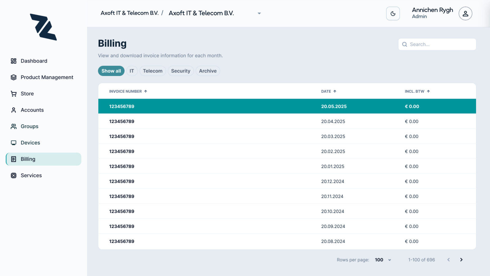
Billing, current version
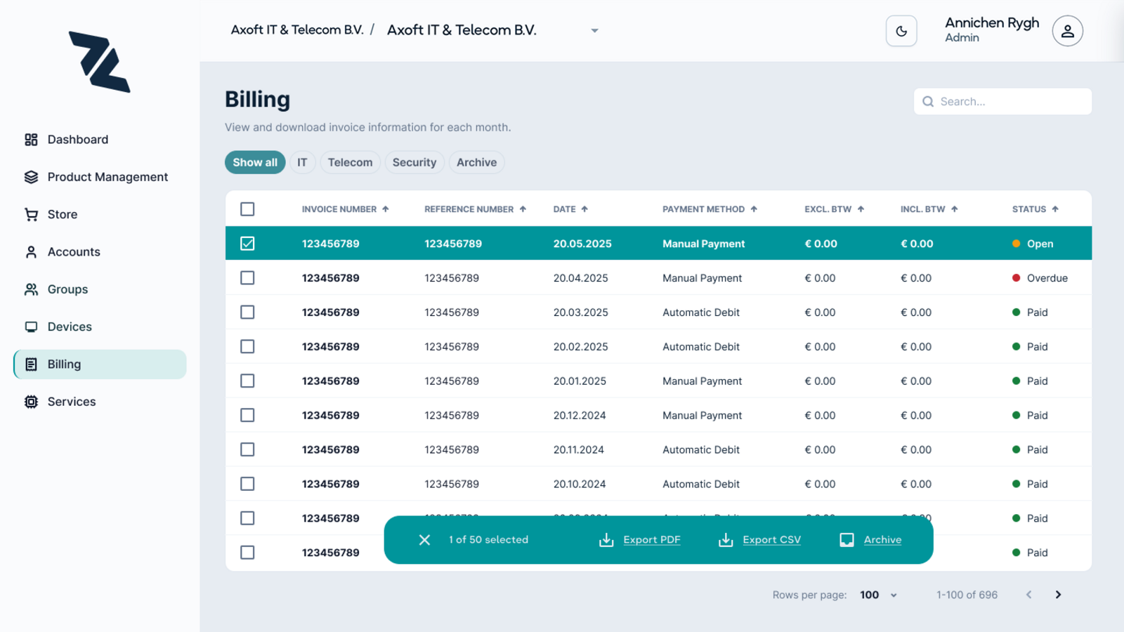
Billing lets people select multiple invoices at once and export or archive them together, and that pattern came directly from watching the MSP team describe doing the same action, one row at a time, across long lists, pulling several invoices for a client who needed them together. Once that pattern showed up in more than one conversation, it became an obvious candidate for a proper interaction rather than something left implicit.
Feedback since launch has been informal but consistently positive. It's still early, so I don't have hard adoption numbers to point to yet, but the reaction from both the internal team and the clients using this page has reinforced that solving the "same task, over and over" problem, and giving clients real transparency, was the right thing to focus on.
Billing is a good example of how Charlz gets built in general. It's not a product I design once and hand off. It keeps evolving through an ongoing loop of feedback and input, both from clients using the platform and from our own users at Axoft on the MSP side, and every new page or redesign builds on what that loop surfaces.
Outcomes
The feedback from both internal Axoft users and external clients has been consistently positive. People understand what Charlz is for, they like how it looks, and they see how it creates value for them. That was the goal from the beginning, not just a functional portal, but one that felt considered.
What I'm most satisfied with is something harder to measure. The team has genuine ownership over this product. The workshop we did at the start set the tone. People's input shaped what Charlz became, and that's kept the motivation to evolve it real and ongoing.