UX Research · UX Design · Prototyping
Overview
Skopei is a Delft-based company (now headquartered in Rijswijk) that builds smart locks and a software platform for sharing, renting, and managing company assets, from bikes and cars to parking and meeting rooms. At the time of this project, their website had to speak to two very different audiences at once. Customers were companies who wanted to manage facilities for their own employees, while providers and partners were mobility and sharing businesses, like MobEazy and CycleShare, who supplied services through Skopei's platform.
Those two groups have almost nothing in common as far as what they're looking for, yet the site was trying to address both with largely the same pages and language. Skopei knew this was a problem. They just didn't know exactly where it was breaking down or how to fix it, which is where this project came in.
Research
Skopei's user base was too broad to research all at once. I started with an expert interview with a Skopei employee and sketched six brief personas covering the different customer and provider types, then picked one to focus on, municipalities, a segment Skopei staff felt was both promising and easy to reach. From there, I combined interviews, usability testing, and desk research to answer four questions. How do users experience the website, do they understand the content aimed at them, what problems do they run into, and what do they actually want to see?
Method 01
An expert interview with a Skopei employee shaped the initial personas. Municipality recruitment was slow going, so I interviewed two facility-managing employees at Gemeente Rotterdam and supplemented that with two employees at other companies who were also potential Skopei customers.
Method 02
Five usability experts explored the live website using the RITE method (Rapid Iterative Testing & Evaluation) and a think-aloud protocol, working through a scenario where they had to figure out how to get bike-sharing set up for their employees.
Method 03
I ran the same scenario and think-aloud protocol with the municipality and company employees from the interviews, to see how real, non-expert users experienced the site rather than trained evaluators. Sessions were screen-recorded for later analysis.
Method 04
I reviewed Skopei's stakeholder map and value proposition canvases, audited the existing website in detail, and ran a competitive analysis on how other two-sided platforms present themselves to both sides of their marketplace.
What we found
The same handful of problems kept coming up, whether I was watching a usability expert or a potential customer work through the site.
Design direction
I translated the research insights into How Might We questions in Miro, then clustered them down to one main question with two supporting sub-questions covering the two biggest issues, the lack of separation between user groups, and the lack of clarity around what Skopei's product actually was.
"How might we help the user find the information they're looking for?"
Sub-questions — "How might we make sure the two users find information applicable to them?" and "How might we present a customisable application with several different functions in the simplest way possible?"
To answer the sub-questions, I ran a creative session with usability experts, using diverging and converging exercises to generate a wide pool of ideas without anchoring too closely to Skopei's existing site. I then ran a solo session on the main HMW question, using a morphological chart to turn those ideas into 16 possible concepts, and a Harris Profile (nine criteria scored against my research insights) to narrow them down. Two of my top three concepts turned out to be near-identical, so I carried two distinct directions forward.
Concept
Two directions came out of the Harris Profile as strong contenders. To choose between them, I mapped every research insight against both and checked which one addressed each insight more directly. The winning direction solved the confusion around who the site was for and what the product actually did more clearly than the alternative, so I carried it forward into wireframes.
Chosen direction
Split the site clearly into a customer-facing main section and a separate area for providers and partners, reached via a prominent header CTA. Add a dedicated "Our Product" page, and let users build their own Skopei application interactively, so the connections between services are something they experience rather than read about.
When I mapped both shortlisted concepts against the research directly, this one addressed more of the insights, particularly the confusion about audience and the lack of understanding of how Skopei's services fit together as one product. I could have just gone with whichever concept scored highest on the Harris Profile, but at that stage neither felt fully resolved. The profile had scored ideas and features, not a finished design, so it took this side-by-side comparison against the actual research to settle it.
Design & iteration
Once I'd settled on the concept, I wrote user stories to pin down individual features, then prioritised them with the MoSCoW method. A page for building your own application and a clear header CTA for providers came out as "must haves," while showing how client relationships had evolved over time landed as a "could have."
I hand-sketched the wireframes first and reviewed them with Skopei's UX designer before moving to high fidelity. That conversation settled a couple of decisions I hadn't nailed down yet, including where to place the "build your own application" CTA and what to actually call the feature.
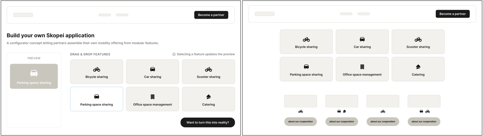
Prototype testing
I tested the first clickable prototype with potential customers, and separately with six colleagues at Skopei, who were eager to see the redesign and gave feedback shaped by a much deeper understanding of their own users. The overall design and clarity landed well. The more useful feedback pointed to specific rough edges.
Skopei's own team called out the "request a demo" finding as one of the most useful insights from the whole project, since it ran directly against an assumption that had been baked into their existing site.
Final design
The final prototype centred on two connected features, each addressing one of the biggest research findings. Users didn't understand who the site was for, and they didn't understand how Skopei's services fit together.
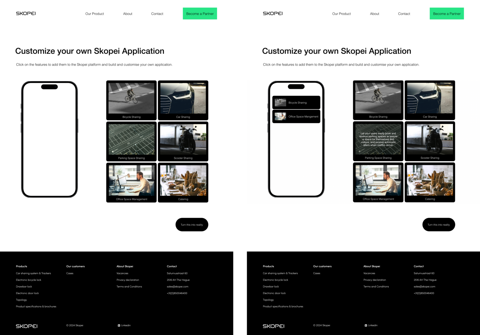
An interactive page where customers build their own version of the Skopei app, clicking to add or remove services like bikes, cars, parking, and meeting rooms. Selected services grey out once added, and hovering over any of them shows a short description, so users don't have to leave the page to understand what they're adding.
A CTA at the bottom carries the user's custom build through to the contact form, where they can keep editing it, turning what they've put together into an actual conversation with Skopei.
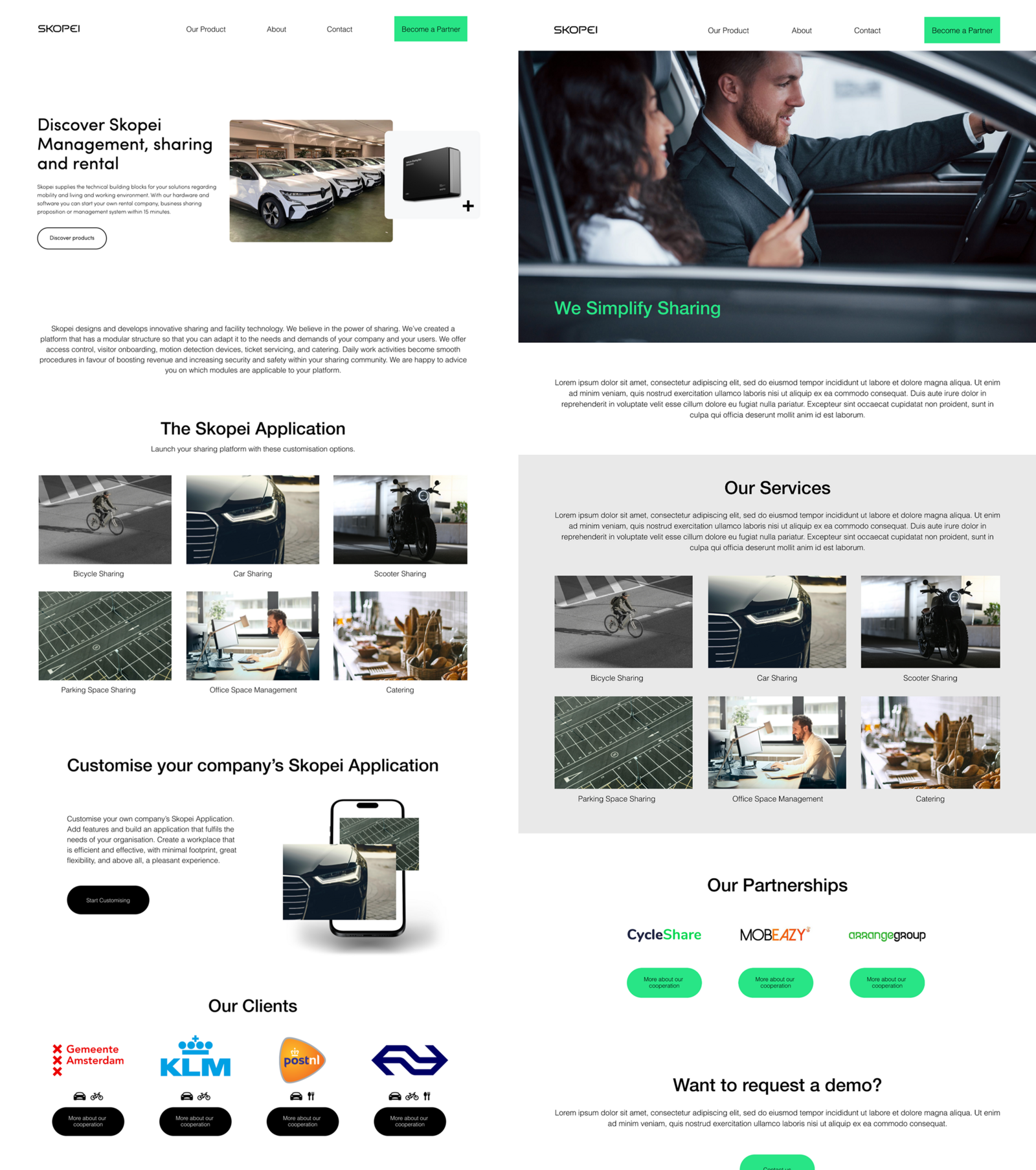
The site is now split by audience. The main pages are built for customers, while a prominent "Become a partner" CTA in the header leads providers to their own dedicated section, so neither group has to wade through content meant for the other.
Client logos on the front page now link to individual case pages covering what the company does, which Skopei services they use, how they benefit, and a quote about the collaboration. Small icons under each logo also show at a glance which services that client uses.
Outcomes
The project produced a tested, iterated prototype that Skopei's own team reviewed and responded well to. It also surfaced findings, like the "request a demo" friction, that ran counter to assumptions their existing site had been built on.
What I took away wasn't just a redesigned website, but a clearer sense of how to get from open-ended research to a design decision I could actually defend. Tools like the Harris Profile and insight-mapping meant the reasoning behind a direction was traceable, not just a matter of taste.
6
Months, running the project end-to-end during my internship, from research through final prototype.
5+
Usability experts and potential customers involved in heuristic evaluation and evaluative research, alongside 4 in-depth user interviews.
2×
Rounds of iteration, one from Skopei's UX designer on hand-sketched wireframes, one from prototype testing with customers and 6 Skopei colleagues.